Key Takeaways
- Claude Design builds, edits, and iterates on real websites through plain language instruction, no visual editor required
- The tweak and comment features make revisions feel like marking up a document, not fighting a panel menu
- It does not replace the person who knows what good looks like; it makes them faster
- In the wrong hands, it will produce something technically complete and visually awful
- The ceiling is no longer the tool. It is the person directing it.
I learned to code in Dreamweaver. I use that word loosely.
What I actually learned was how to drag elements onto a canvas, watch the software generate HTML I did not understand, and feel briefly like I had built something. The code tabs were there. The panels were full of options. I had the whole thing open and felt like a developer.
I remember finding a hex code on a forum, typing #00FF00 into the background colour field, and watching my first site flood with the most aggressive shade of green imaginable. It looked radioactive. I thought it looked great.
Then I hit preview, the layout collapsed in Internet Explorer, and I spent an hour clicking through property menus with no framework for reading what was in front of me.
Dreamweaver's promise was that you did not need to understand code to build a website. You just needed to be able to see it and move things around. What You See Is What You Get.
It did not deliver. The gap between the visual canvas and the actual output was full of table-based layouts, inline styles, and the specific anxiety of not knowing why nothing looked the same once it was live.
WordPress took a different swing
WordPress simplified publishing. Dreamweaver was for people who wanted to build. WordPress was for people who wanted to write and publish without touching code.
The page builder plugins came later. Elementor. Divi. The Gutenberg editor. Each one carrying the same claim: a non-developer can now build a professional website, no code required.
Each one delivered something functional, if you were patient, template-dependent, and willing to accept a site that looked like every other site built on the same theme. The moment you wanted something outside the component library, you were either calling a developer or learning CSS.
The ceiling was low. Customisation was shallow. And you always knew, looking at it, that you were working inside a box someone else had built.
Two weeks ago, Claude Code was the impressive one
Before we get to Claude Design, it is worth acknowledging where things were sitting just recently.
Claude Code, Anthropic's terminal-based coding tool, had become the most interesting thing in this space. With the right prompts, enough patience, and someone who understood what they were asking for, you could get outputs that started approaching the quality of something built in Framer. Not always. But close enough to make you stop and look twice.
That was the benchmark a fortnight ago.
Claude Design changes it. Where Claude Code required you to work through a command line and think in terms of code structure, Claude Design is built for the design layer specifically. It understands visual outcomes, not just technical ones. The gap between what you describe and what appears on screen is significantly smaller.
What Claude Design actually is
Claude Design lets you build a website with AI through plain language. You describe what you want, it builds it, you iterate. No dragging, no panel menus, no fighting a block editor that does not understand what you are trying to say.
That sounds like what Dreamweaver promised. The difference is what comes out the other side.
Claude Design produces real HTML, CSS, and JavaScript. No proprietary blocks. No plugin dependencies. Open any file it generates and you can read it, edit it, hand it to a developer who has never heard of Claude Design and they can pick it straight up.
Elementor exports code that belongs to Elementor. Claude Design exports code that belongs to you.
The features that change the workflow
Two things stand out.
The tweak feature handles iterative refinement without rebuilding from scratch. You describe the change, targeted at the specific element, and it makes it. Not a regenerated page. A surgical adjustment. The WYSIWYG promise finally lands here, except instead of a cursor you are using language. "Pull the hero back. One CTA only. More white space." Done.
The comment feature is where it starts to feel like a design review session. You annotate the output, flag what is not working, add notes the way you would mark up a design in Figma before sending it back. It works through the comments and addresses them. Review then revise, rather than delete and rebuild. That is how designers and developers already think.
Beyond those two: it can fade a hero image cleanly into a section background without you touching a line of CSS. Adjust font sizes responsively across breakpoints from a single instruction. Swap colour palettes, tweak contrast ratios, add scroll-triggered animations, drop in overlays. Things that would previously require a developer to touch the stylesheet, or an hour in Elementor's style panel, happen in a sentence.
It holds the full context of your project. It can tell you why it made a structural decision. It will flag a conflict if what you ask for breaks something already in place. Show it a screenshot of a page you want to match and it will work from that reference.
Working in it feels less like operating a tool and more like briefing someone who actually read your document.
It still needs someone in the driver's seat
Here is the part the pitch tends to skip.
Claude Design is not a replacement for the person who knows what good looks like. A marketer who understands information hierarchy, what a CTA needs to do, and how a brand should feel across a page will get dramatically better output from it than someone typing "build me a website with AI."
A developer brings different value. They will catch the structural issues, question whether an approach holds up at scale, and know when to redirect rather than accept.
The tool is a force multiplier. A strong brief with clear direction produces strong output. A vague brief produces something generic. The difference with Claude Design is the speed at which it produces that output, which makes the quality of the direction matter more, not less.
The bad output problem
Claude Design can generate busy, cluttered, over-designed output. Not because the tool is broken. Because the prompt was vague, there were no constraints, and nothing in the brief said to leave breathing room or limit the number of things competing for attention on the screen.
It optimises for completing the task. Underspecify the task and the output reflects that. It will use three font weights where one would do. It will pack the first fold with content that should be spread across a page. It will produce, with confidence, something that solves the literal brief and misses the point.
This is the same problem as handing someone a power tool when they have never studied how to use one. The tool does not know you lack the knowledge. It just builds.
Scroll through any social feed right now and you will see this at scale. AI-generated ads built by people who have never studied contrast, visual hierarchy, or what actually stops a thumb mid-scroll. They do stop you, just not in the way the advertiser intended. A poorly made AI ad gets scrolled past faster than a poorly made human one, because the confidence of the output does not match the craft behind it. The polish creates an expectation. The content does not meet it.
The professionals who get the most from Claude Design are the ones who can read an output and know immediately what to say next. Not "fix it." Something more precise. "The hero is working. Remove the second CTA entirely. The typography below the fold is competing with itself."
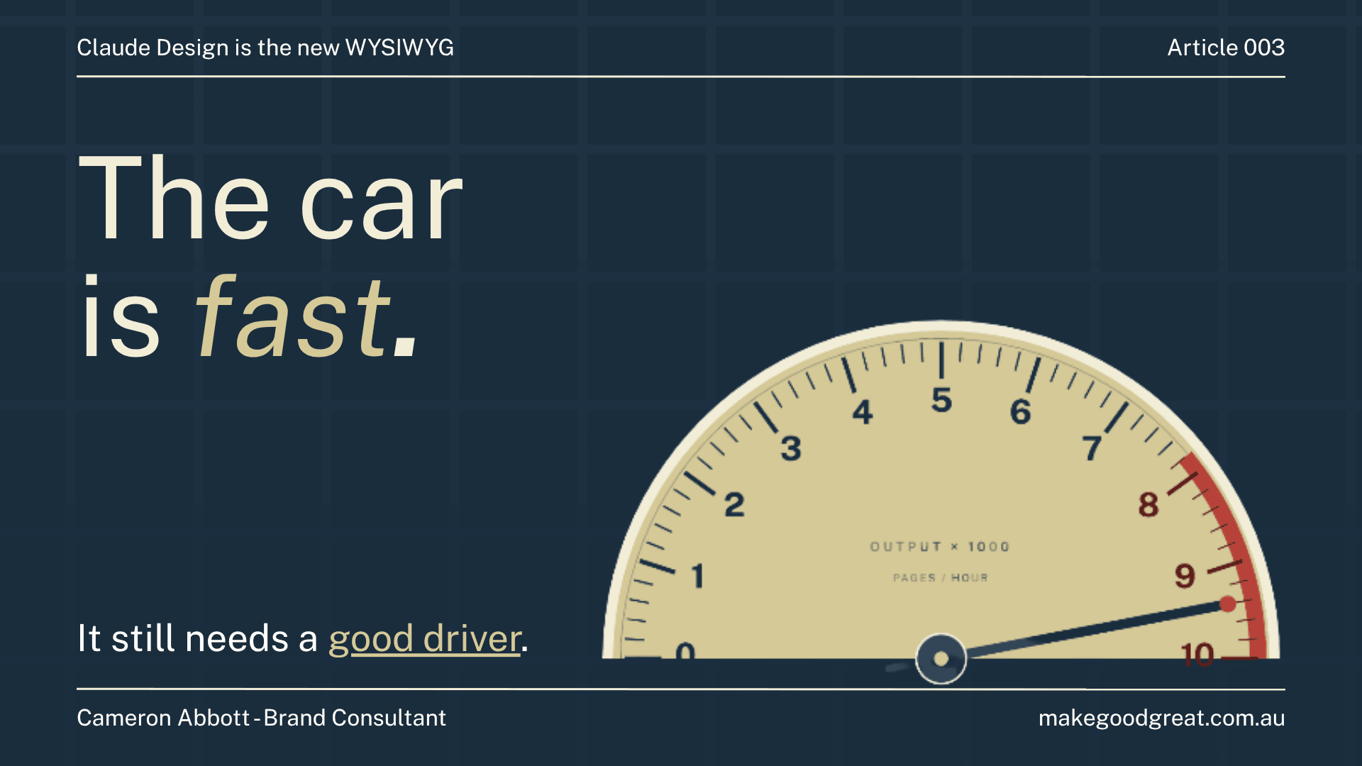
That is the driver. The car is fast. Those are different things.
The ceiling moved
The tools that change how things get built are the ones where the ceiling shifts. Not the ones that make it easier to do what was already possible.
Dreamweaver's ceiling was CSS floats and cross-browser chaos. WordPress's ceiling was the component library and the theme it came with. Claude Design's ceiling is the quality of the person directing it.
It is not perfect. The bad output problem is real. But the promise Dreamweaver made in the early 2000s, that someone who is not a developer can build a website with AI, that promise is actually there now. Not automatically. Not without direction. But it is there in a way it was not before.
Curious what tools like this can do for your business? Let's chat.